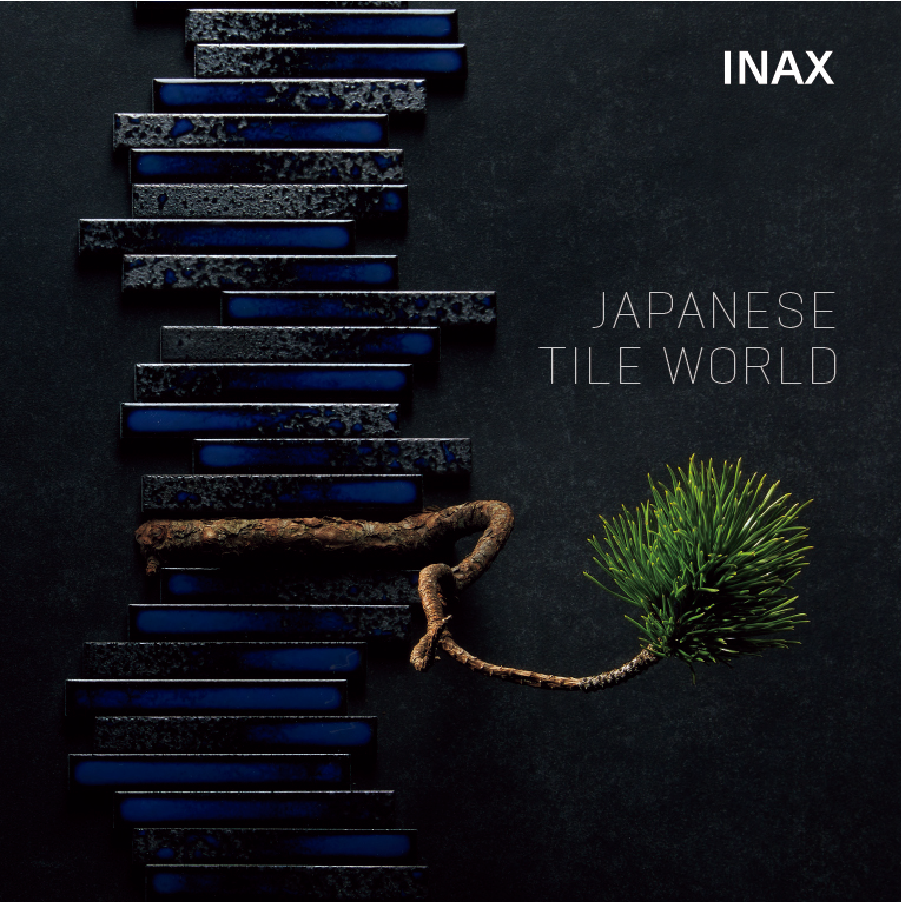
Special Editions 13KASANE Tiles in layers In Japanese culture, beauty is often found not in a single layer, but in the interplay of multiple layers. This Japanese aesthetic cherishes the depth and resonance created by layering, as seen in the Juuni-hitoe with its layers of seasonal colored kimonos, and the Shakkei which overlays the natural landscape onto the garden. We propose expanding design possibilities by layering JTW.


Adding Definition to the Space:
Layers of Contrast
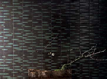
HIBOSHI×SAWARABI
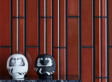
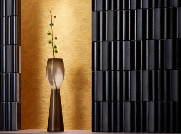
In Japanese architecture, the Tokonoma is an alcove in a Japanese-style room where guests are welcomed with seasonal flowers and Kakejiku (hanging scrolls). These two completely different designs—"HIBOSHI" White and "SAWARABI" Black—create a contrast between stillness and movement, adding a dignified atmosphere to the space.


Adding Depth to the Space:
Layers of Harmony
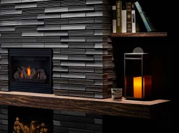
TSUCHIORI×BIYUSAI
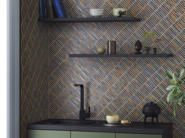
By layering the earth-toned "TSUCHIORI" like a gradient, we create a depth that single colors cannot express, bringing a sense of harmony and unity to the space. Furthermore, the shadows created by the concave surfaces overlap like waves, adding an even greater sense of depth to the space.


Adding Color to the Space:
Layers of Color
YOHEN
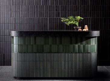
We created an impressive bathroom with tiles layered in creative freedom and a bold color palette, reminiscent of the Juuni-hitoe (twelve-layered kimono). By layering the new colors of "YOHEN"—inspired by traditional Japanese colors—each color stands out yet resonates with the others, creating a space of beautiful harmony.


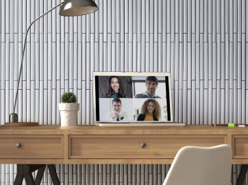
Other tile ideas for the layers


Catalog
Archives
Special Editions 01
JTW Collaborated with
Japanese Floral Art
2020 Spring
Special Editions 02
Upgrade your interior
with JTW tiles
2020 Autumn
Special Editions 03
Enjoy your Stay Home
with JTW tiles
2021 Spring
Special Editions 04
Required“HEALING”
2021 Autumn
Special Editions 05
Cast dramatic magic
on space
2022 Spring
Special Editions 06
Ka(flower),Cho(bird),
Fu(wind),Getsu(moon)
2022 Autumn
Special Editions 07
Hospitality in Japanese
Architecture
2023 Spring
Special Editions 08
"JTW" refines scenes of daily life.
2023 Autumn
Special Editions 09
A meeting of fate with
other materials
2024 Spring

Special Editions 10
Connect naturally
2024 Autumn

Special Editions 11
Neo-Impressionism by JTW
2025 Spring
Special Editions 12
“Resonance”
The combinations of tiled wall and tiled counter
2025 Autumn